WInvest · 0–1 mobile product design
Helping people build financial confidence with AI
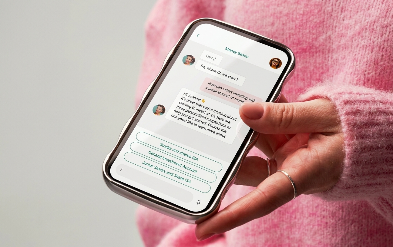
As founding designer, I led product design for WInvest from research through to a launched iOS app, working closely with the founder and engineering team over 10 months.
I designed the whole experience end to end — research-led structure, UX, visual identity, the design system, the AI assistant and a financial-literacy game — to make budgeting, spending and investing feel approachable and easy to act on.
WInvest is live on the App Store. This case study covers the product design work I led; like any startup, the product has continued to evolve since.
About the product
WInvest helps people build financial confidence through education, personalised guidance and AI-driven support across budgeting, spending and investing. The product began focused on women's financial confidence and later broadened to a wider audience.
Research
What we heard
I designed from user research the team gathered. It surfaced recurring barriers: lack of education, lack of control, misinformation, fear of risk, no habits and low confidence. These shaped the whole product structure.
- “I feel like I'm losing an opportunity. I don't have the information or the security to do something different.” — lack of education
- “I don't understand why we make so much money, yet still struggle with debt. Where is it going?” — lack of control
- “I was getting fragmented information from different people, so it was hard to know what to do.” — misinformation
- “I didn't feel confident doing it. It takes a lot of effort to look at things.” — low confidence
Setting the foundations
Structuring the product
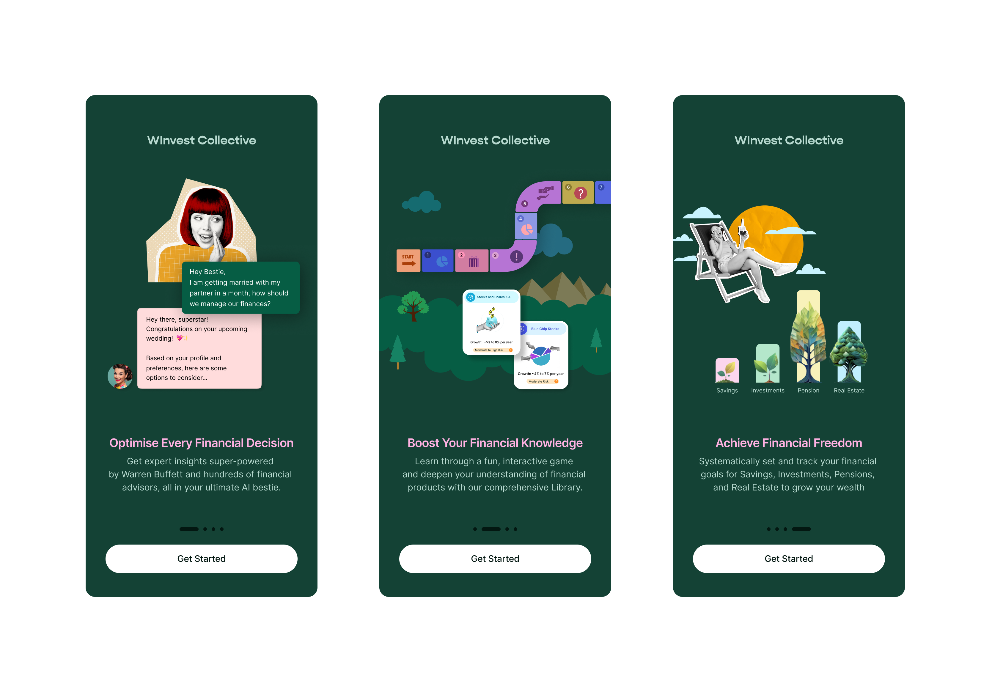
With the team I ran a cross-functional workshop to define the app's goals and areas of engagement, and identified target personas. I turned the research into a clear model: guide users from understanding money, to managing it, to acting with confidence — the structure the whole product is built on.
The map below shows the full journey I defined — from first questionnaire to daily use — so every flow had a clear job before any screen was designed.

Onboarding
Understanding each user from the start
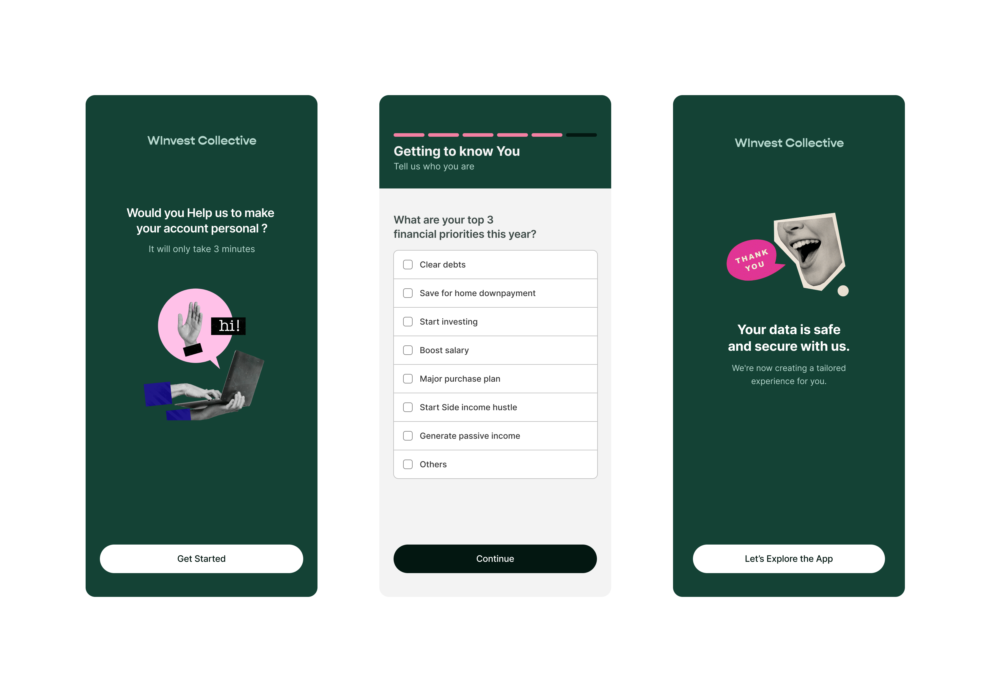
I led the research synthesis and turned it into a clear product vision, then aligned the founder and engineers around it in a cross-functional workshop where we defined the app's goals, target personas and areas of engagement. The vision I set became the model the whole product is built on: guide users from understanding money, to managing it, to acting with confidence.
What I designed
- A welcoming sign-up and onboarding flow
- A step-by-step questionnaire that captures needs without friction
- Goal and priority selection to personalise what comes next
AI assistant
Turning data into plain-language guidance
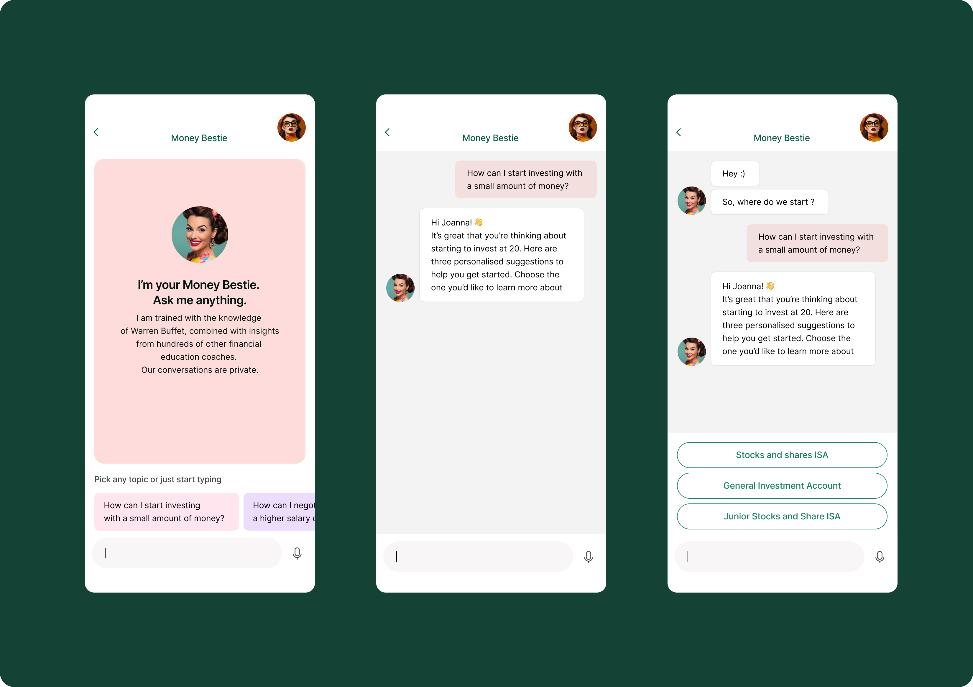
Generic finance advice doesn't build confidence. I designed a conversational AI assistant that interprets a user's situation and responds with personalised, plain-language guidance — a supportive companion rather than a lecture. The tone was deliberately warm; research showed a collaborative voice worked better than an instructive one for this audience.
What I designed
- A conversational assistant that answers real money questions
- Personalised suggestions the user can choose to explore
- A consistent, supportive tone across the whole experience
Control, track and grow
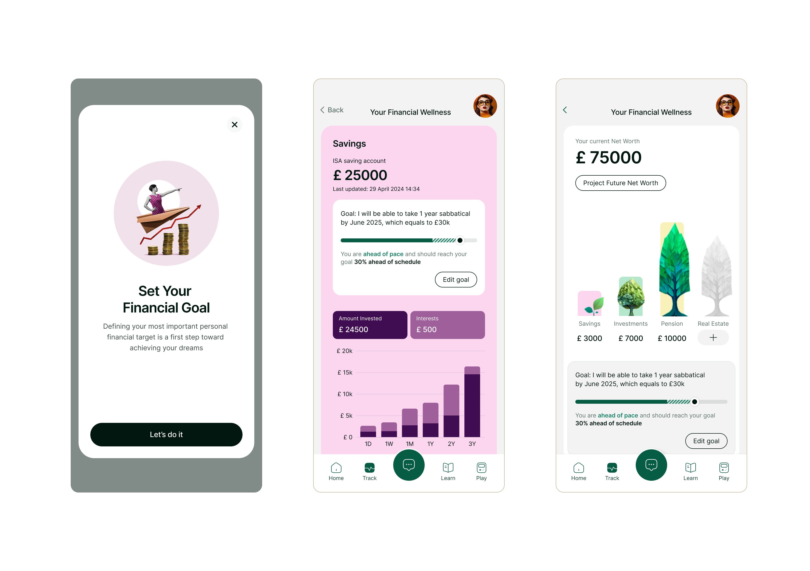
Seeing the whole picture and where it's going
Users connect their accounts for a real-time view of their money, set custom spending ratios across essentials, non-essentials and future investments, and see a projection of their net worth over time. The projection makes an abstract goal tangible: it updates as people adjust how they split their money.
What I designed
- A net-worth projection that responds to the user's choices
- Custom spending ratios with automatic transaction categorisation
- Goal tracking with clear, motivating progress
Education
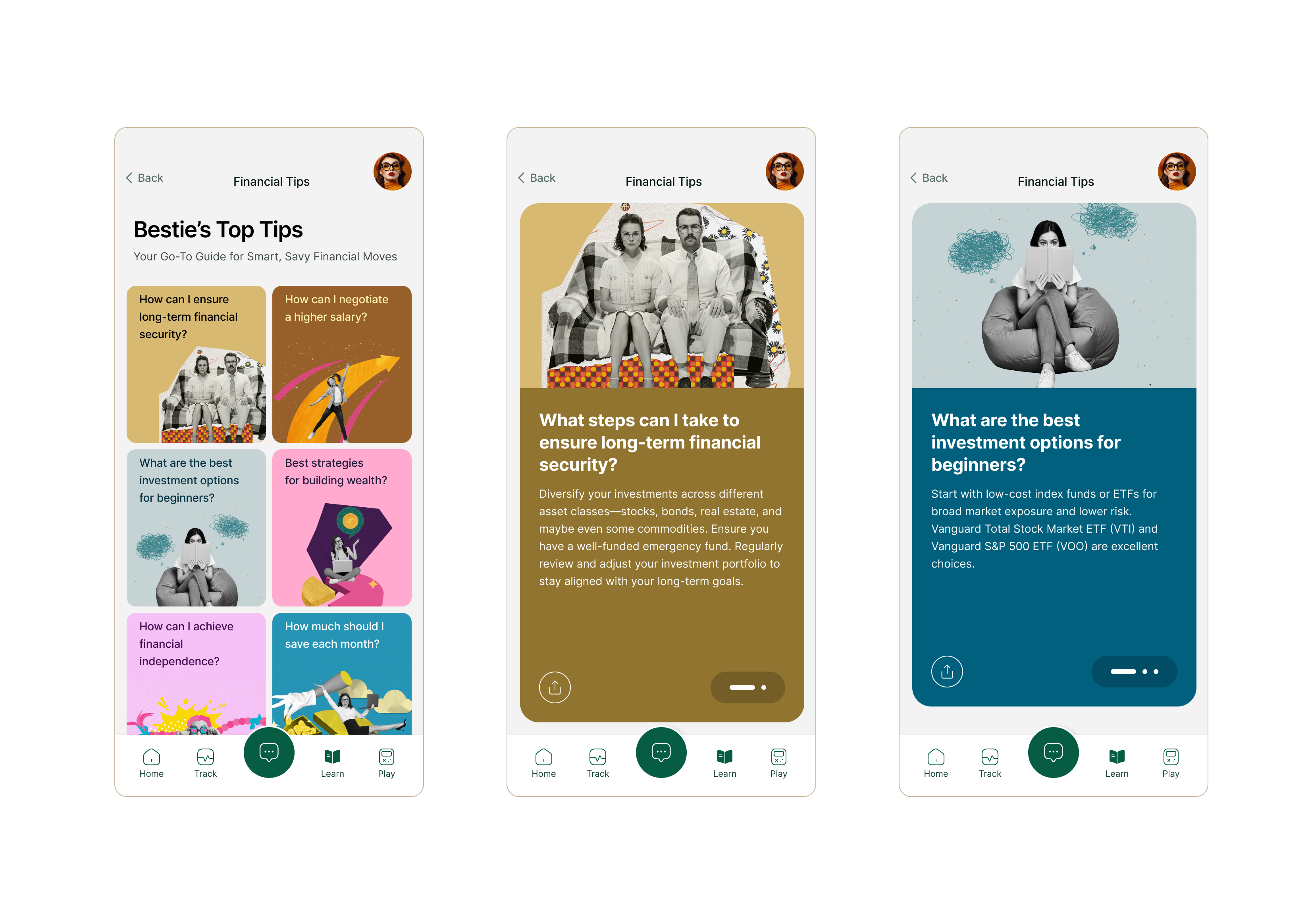
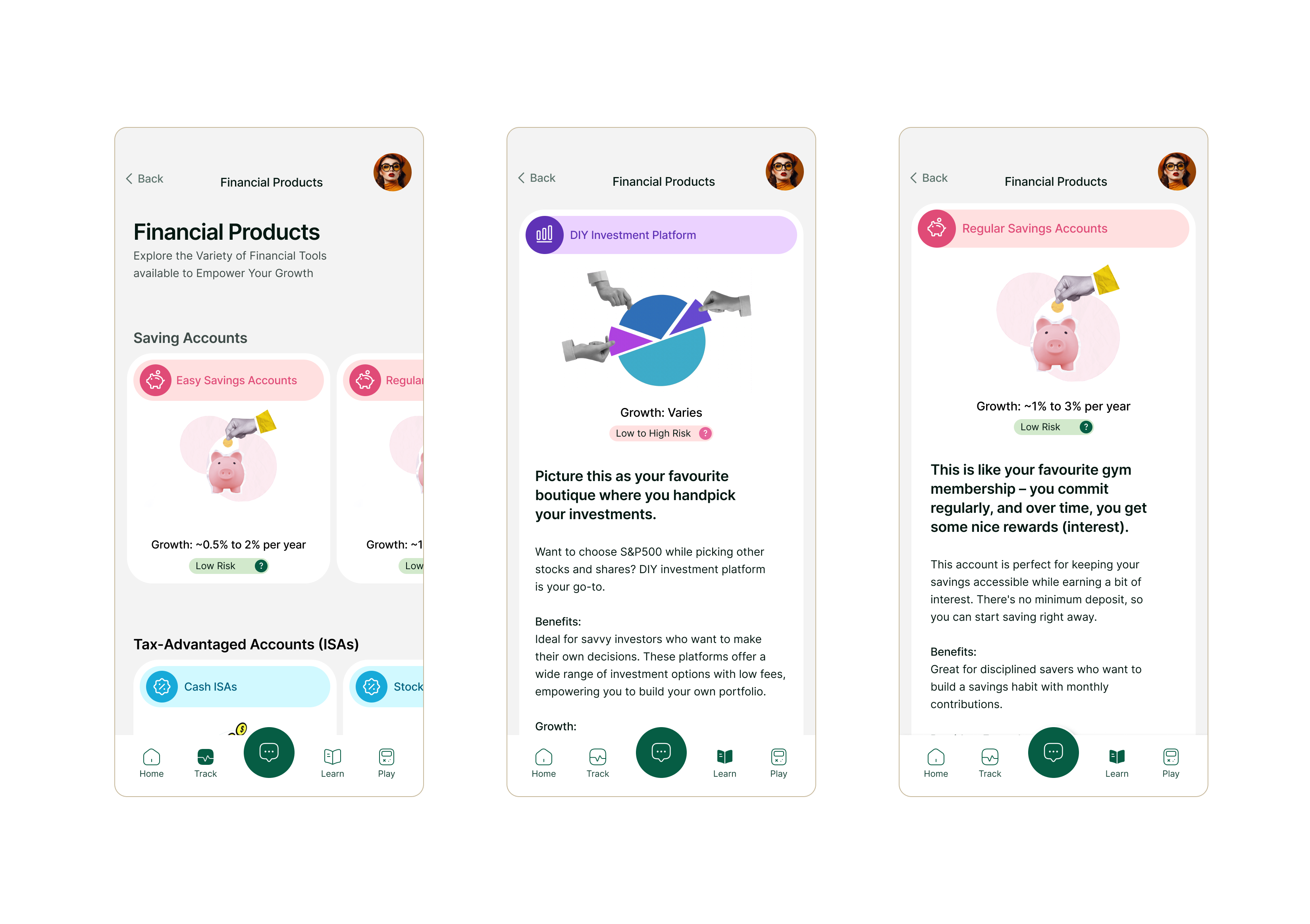
Learning in bite-size steps
Financial confidence starts with understanding, so I designed the learning experience to teach in small, digestible steps rather than overwhelming users with information. Short lessons, plain language, and progress that builds over time turn a daunting topic into something approachable.
The game
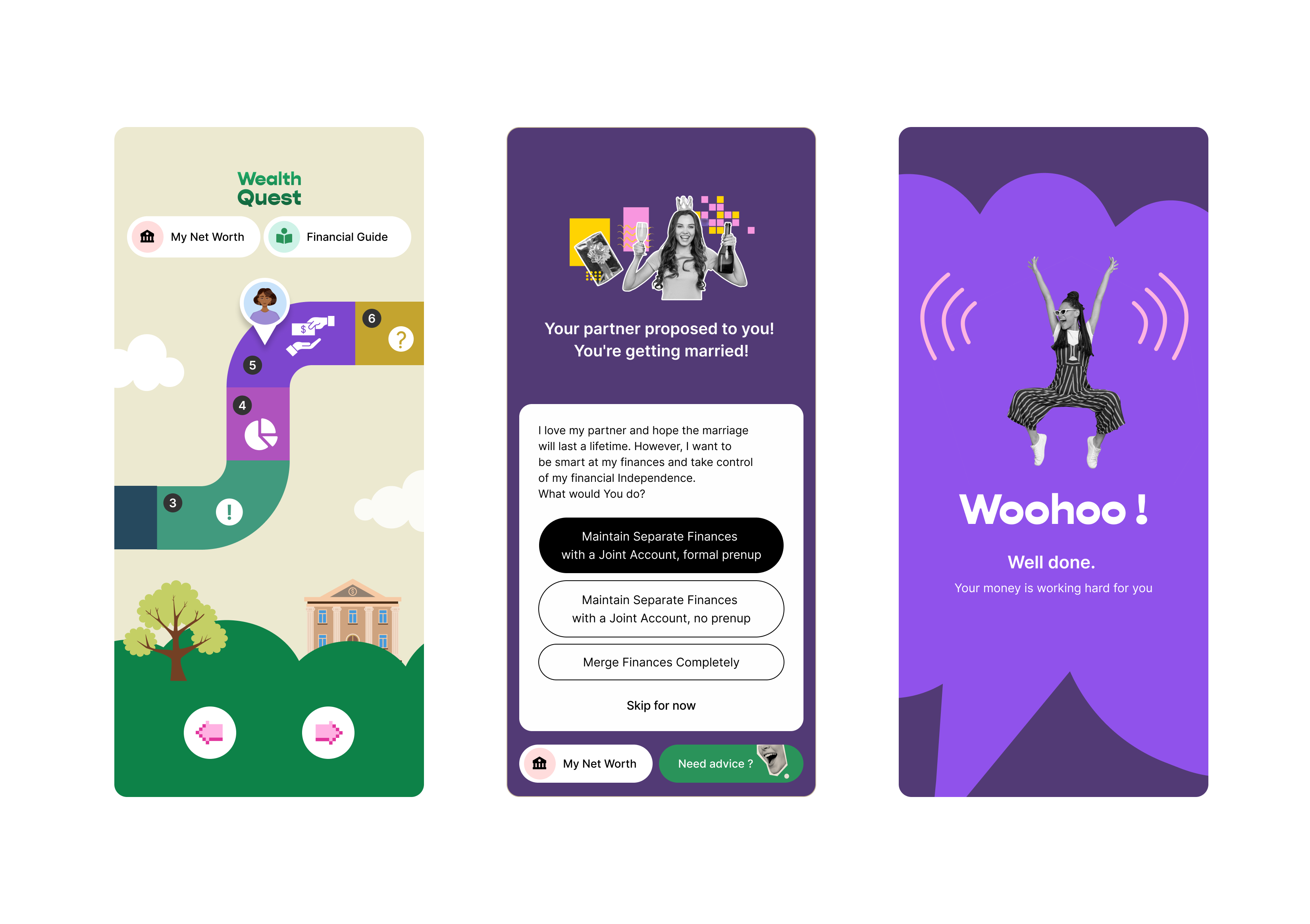
Learning money through play
To make financial decisions less intimidating, I designed a game that lets people practise real-life money situations in a safe, low-stakes way. It turns abstract concepts into decisions users can feel the consequences of, reinforcing the learning elsewhere in the app.
What I designed
- Scenario-based decisions drawn from real financial situations
- Clear feedback that connects choices to outcomes
- A playful visual language that keeps a serious topic light
Design system
A scalable system built from scratch
As founding designer I built WInvest's design system from scratch: a modular, scalable component library with a defined colour, type and spacing system. I built it alongside the product so a small team could ship consistently and add features without rebuilding, and documented it so design and engineering shared one source of truth. It's the ways-of-working foundation that kept a fast-growing app coherent.
What I built
- A reusable, documented component library
- A defined colour, type and spacing system
- States and edge cases considered for each component
- A foundation the team could extend without redesigning
Visual identity
Making finance feel approachable
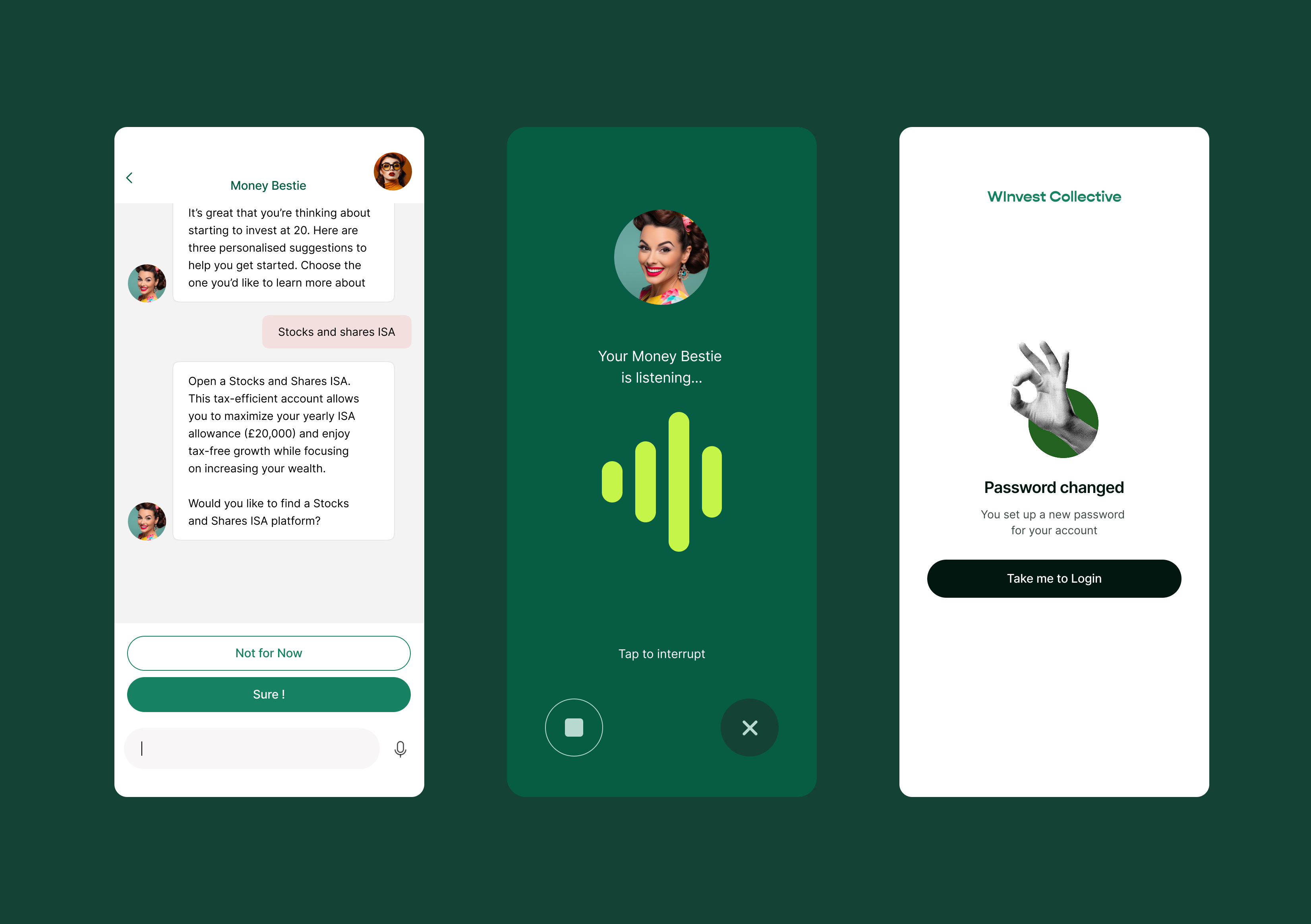
I gave WInvest a bright, energetic visual identity to counter how intimidating finance can feel. Vibrant colour, friendly type and a warm illustrative style make the product feel welcoming and human rather than corporate. Tone of voice mattered just as much: I shaped the language across the whole app to be plain, supportive and jargon-free, so every screen and every AI response sounds like a helpful friend rather than a bank.
Outcome
A complete product, shipped
I took WInvest from research to a launched, customer-facing iOS app as founding designer, owning the full experience: the research-led product vision, onboarding, the AI assistant, tracking and projection, learning content, the game, the visual identity and the design system. It's a native app that turns a complex, intimidating problem — managing money across budgeting, spending and investing — into something approachable, built on a system designed to scale. WInvest is live on the App Store.
What I'd measure next
- Activation through the first goal set
- Week-four retention
- Engagement with the AI assistant and learning content
Key takeaways
- For an intimidating topic, tone and approachability do as much as features. The supportive AI voice, validated in research, shaped every interaction.
- Making the future tangible drives action. The net-worth projection turned an abstract goal into something people could see and adjust.
- Building the design system alongside the product kept a fast-growing app coherent without slowing delivery.