Case study • The Ultimate Money Bestie | Product Design
emoteCare | End-to-End Product Design
Improving Therapist Discovery
for Higher Conversion
I partnered directly with the founders to reshape an early-stage, two-sided therapist marketplace,
leading product design and collaborating closely with engineering to deliver a high-impact redesign.
Owning the end-to-end UX and UI strategy, I improved therapist profile discoverability, introduced
trust-building mechanisms, and streamlined onboarding and booking flows for both clients and therapists.
The result: higher booking completion rates, reduced abandonment in key conversion paths,
and a clearer, more confidence-driven user experience.
Role:
Sole Product Designer
Scope:
Research, UX Strategy, UI Design,
Prototyping, Testing
Platform:
Web, mobile-first
Duration:
7 months
About the Product
EmoteCare is a UK-based online therapy platform connecting individuals
with verified therapists for online video sessions. Users can browse therapist profiles,
book free intro calls, and schedule paid individual and couples therapy sessions.
The main Product challange:
Finding the right therapist is an emotional and high-stakes decision.
The platform must build trust instantly while reducing friction in discovery and booking.
Why Users Weren’t Booking
Despite steady traffic, the platform faced:
• High drop-off during therapist browsing
• Low conversion from profile view → booking
• User uncertainty when comparing therapists
• Friction in the booking flow
Users reported feeling:
• Overwhelmed and unsure who to trust
• Unclear about pricing and next steps
From a business perspective, this meant lost conversions and reduced lifetime value.
Solution: what I focused on
I developed a holistic design strategy across information architecture, interactive UX,
visual identity, and multimedia — incorporating video into user profiles to build credibility,
increase trust, and create a more human brand experience.
Despite steady traffic, the platform faced:
• High drop-off during therapist browsing
• Low conversion from profile view → booking
• User uncertainty when comparing therapists
• Friction in the booking flow
Business goal
To increase long-term user engagement, strengthen retention,
and build a trusted brand that supports sustainable growth.
How I validated it
• Conducted usability testing across onboarding, profiles, and booking
• Identified friction points, bugs, and comprehension issues
• Iterated designs based on observed drop-offs and confusion
METRICS
Daily Active Users
324
over first month
User Retention Rate
34%
over first month
Conversion Rate
22%
over first month
App Store Rating
5.0
over first month
Understanding → Matching
Matching Flow
The user experience begins with a guided matching flow designed to understand their needs
and recommend suitable therapists using AI. It helps users feel informed and confident before making a decision.
Designed in close collaboration with the founder, who is a therapist,
the flow focuses on collecting relevant information in a supportive way.
1. Understanding the User
The flow starts by understanding the user’s
situation and goals, using simple and open questions.

2. Educating along the way
Educational moments are introduced throughout the flow, helping users understand therapy types and what to expect from working with different therapy approaches.

3. Defining the right Therapist
Many users are unsure what to look for in a therapist — this step helps make those criteria more explicit.
The section helps users understand and define what matters in a therapist, focusing on both professional and personal traits.

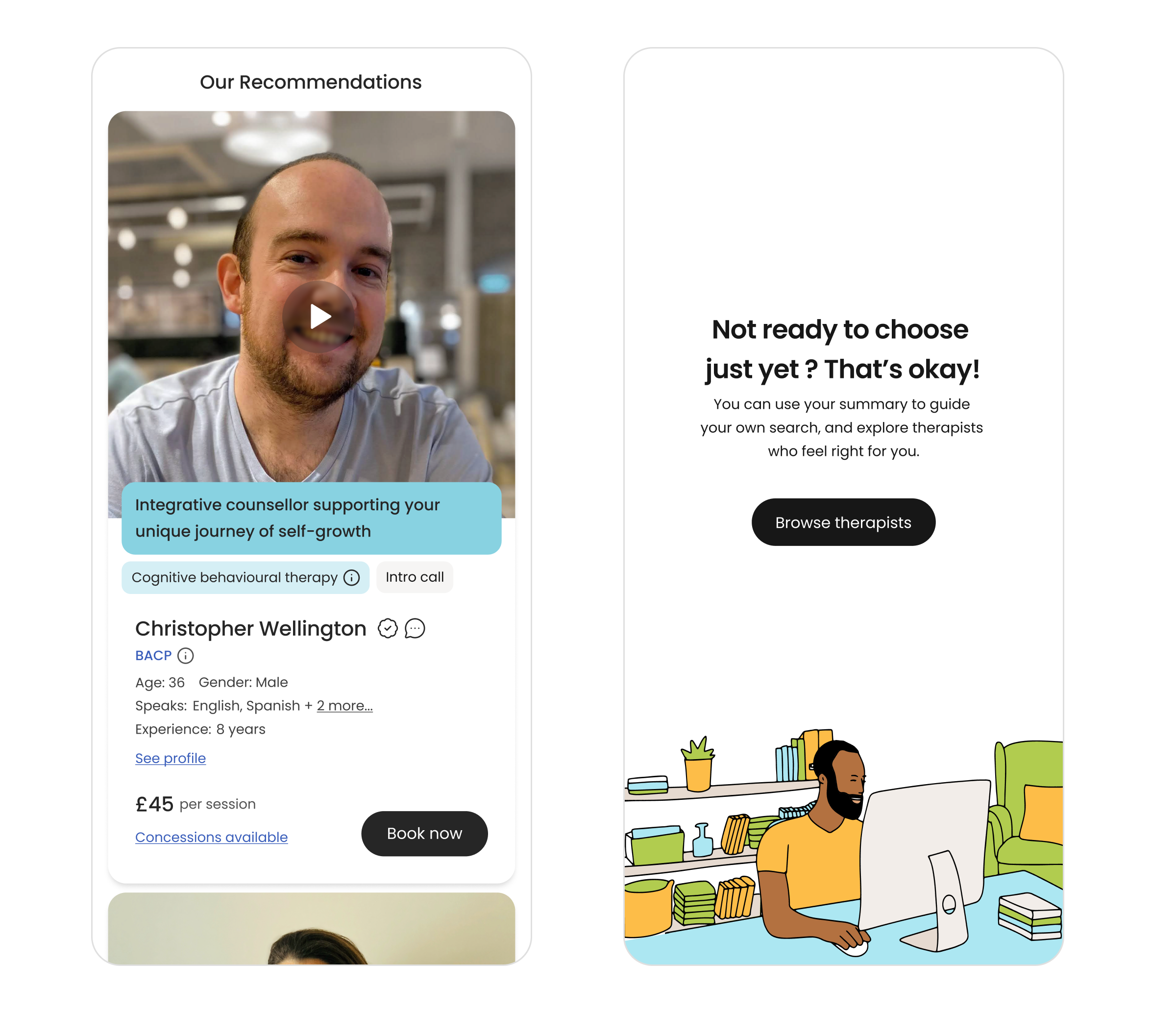
4. Personalised Recommendations
Based on user inputs, the platform generates personalised therapist recommendations, using AI
to match users with therapists that best fit their needs and preferences.
• Analyses responses to suggest relevant therapists
• Reduces decision fatigue by narrowing options
• Provides a more tailored and confident starting point
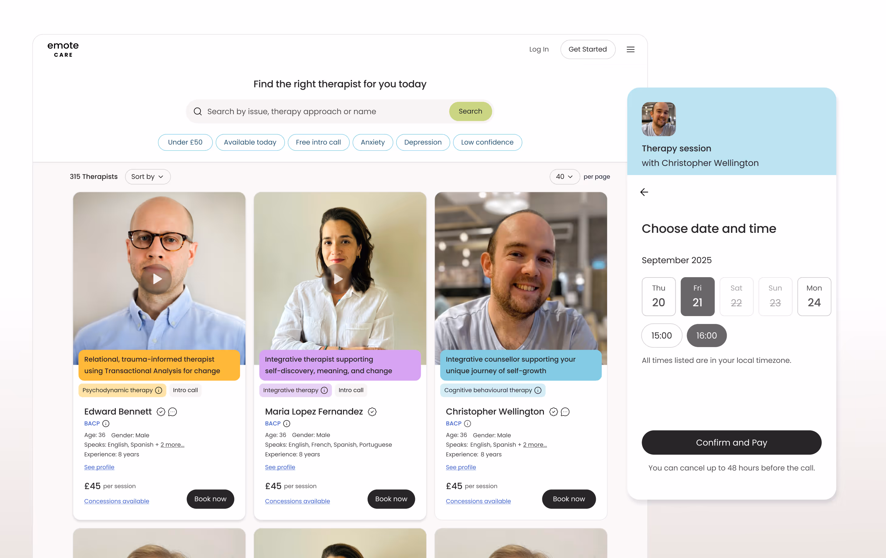
Choosing → Profiles
Fast & Confident Comparison
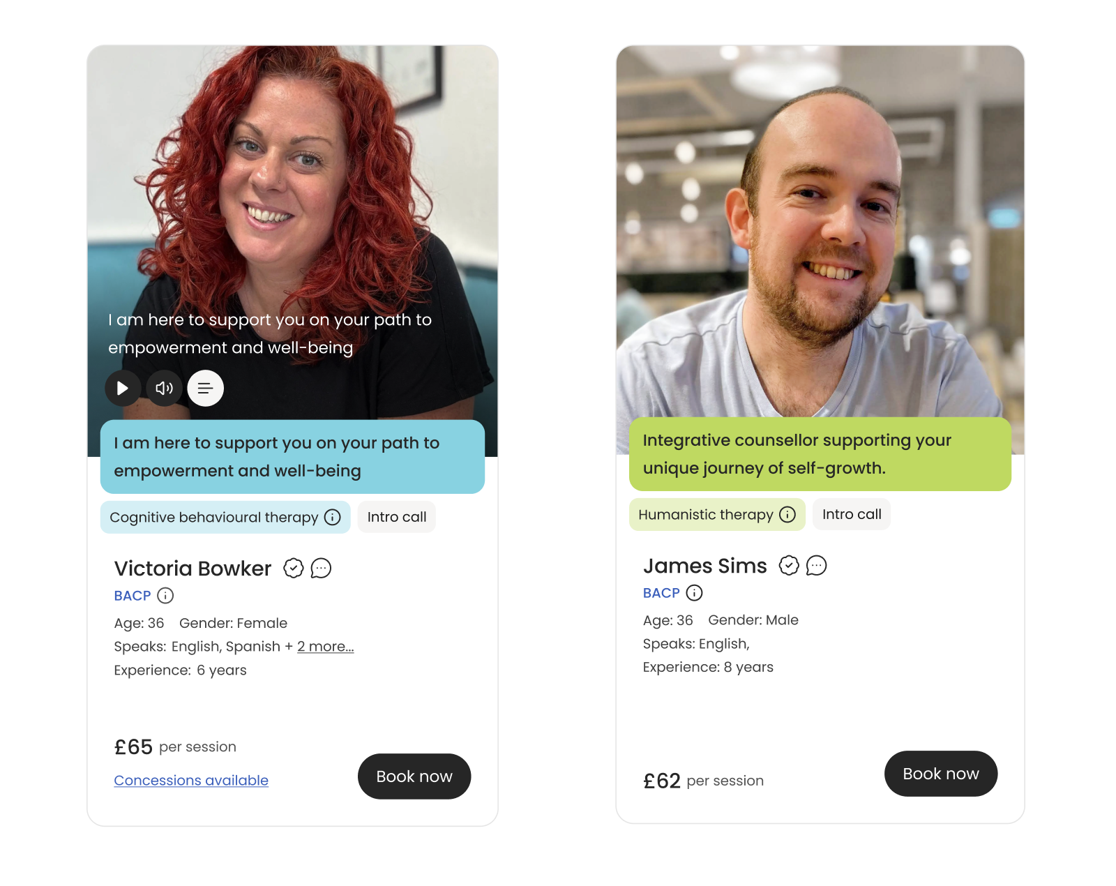
Choosing a therapist is an emotional decision — the design focuses on building both trust and personal connection.
Therapist cards were designed to make key information easy to scan, reducing cognitive load during browsing and helping users quickly identify relevant options.
Clear & Scannable
Therapist Cards
• Large photos and video introductions
to create a more direct sense of personality
• Clear credentials and experience
• Personal introductions
• Single primary CTA to keep
the next action clear and focused
Each therapy type was visually coded using colour, helping users quickly identify relevant specialisations and navigate options more efficiently.

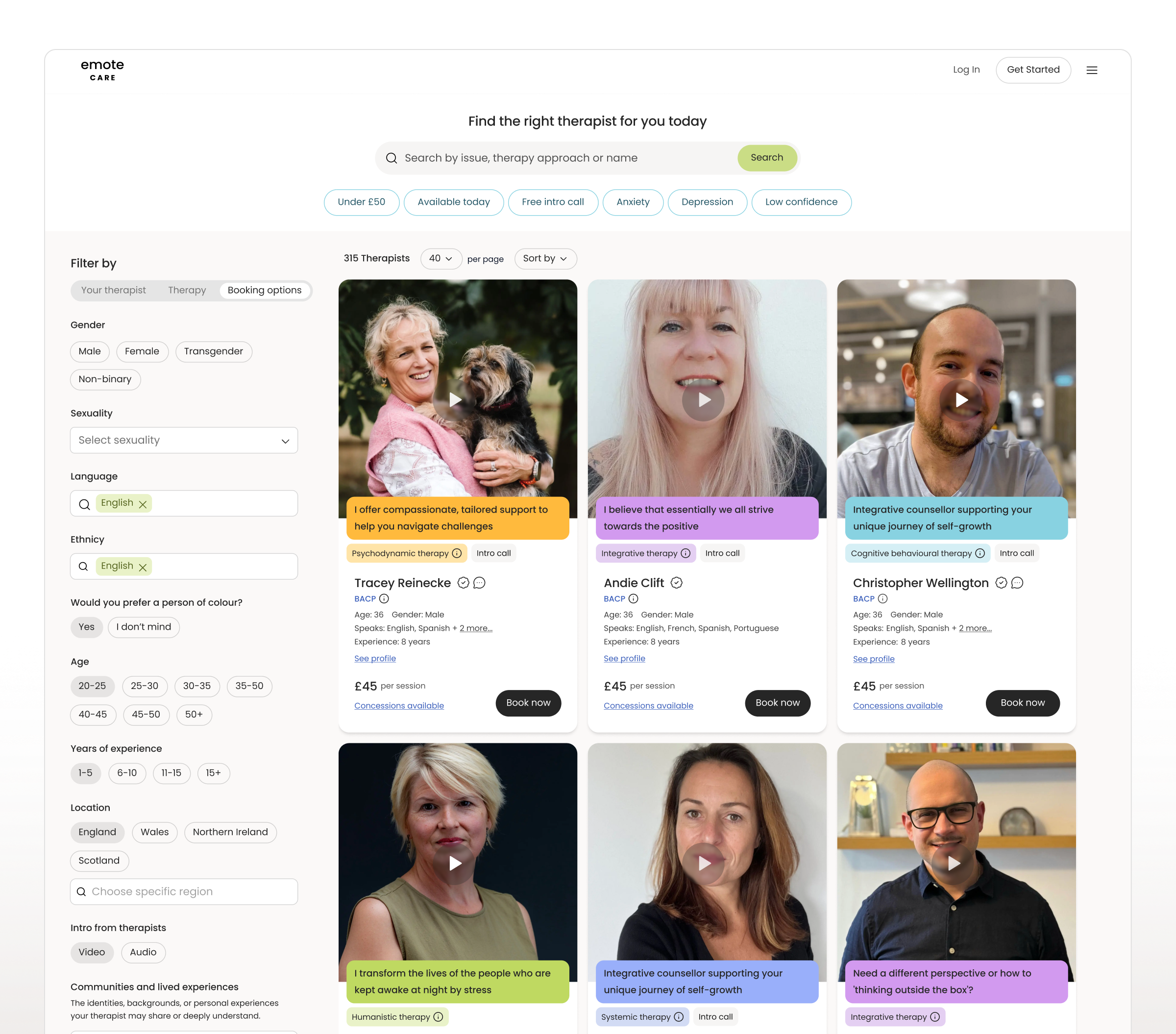
Choosing therapist
Building Trust Through Profiles
The profile experience was designed to balance information with engagement, helping users feel informed without being overwhelmed.
• Structured content to prioritise key decision information (specialties, pricing, credentials)
• Introduced larger images and video to create a sense of personality
• Organised information into clear, scannable sections
• Focused on a single primary action to guide users to take action.
• Mobile-first UI

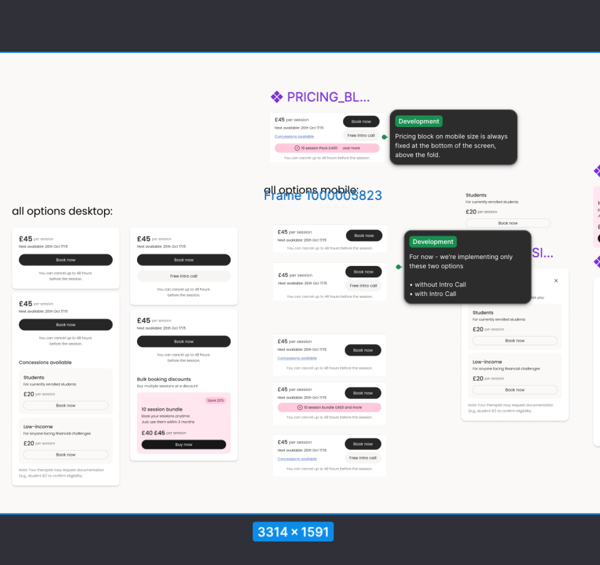
Booking
Reducing Friction in Booking flow
Booking a therapy session is a high-stakes decision, where even small points of friction can lead to drop-offs.
I simplified the experience into a minimal, three-step flow, guiding users from therapist selection to confirmation with clarity and confidence.
The flow focuses on one clear action at a time, supported by strong hierarchy and a single primary CTA, reducing cognitive load and eliminating distractions.
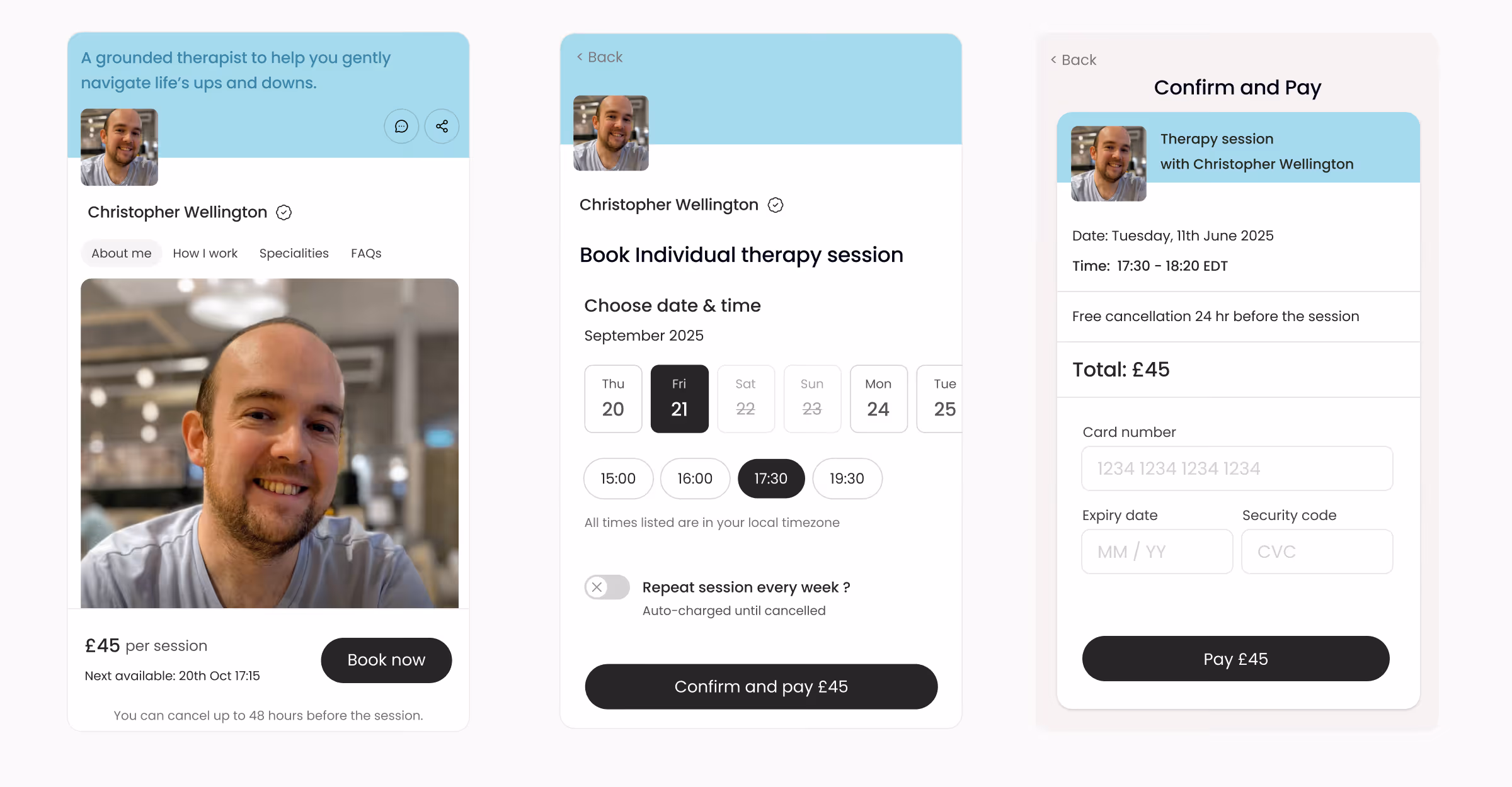
Key Design decisions:
• Reduced the flow to essential steps only
• Prioritised one primary action per screen
• Improved hierarchy to guide user attention
• Made pricing and session details clear before confirmation
Validation:
Usability testing confirmed that users could complete the booking flow independently,
achieving a 100% task completion rate with minimal hesitation.
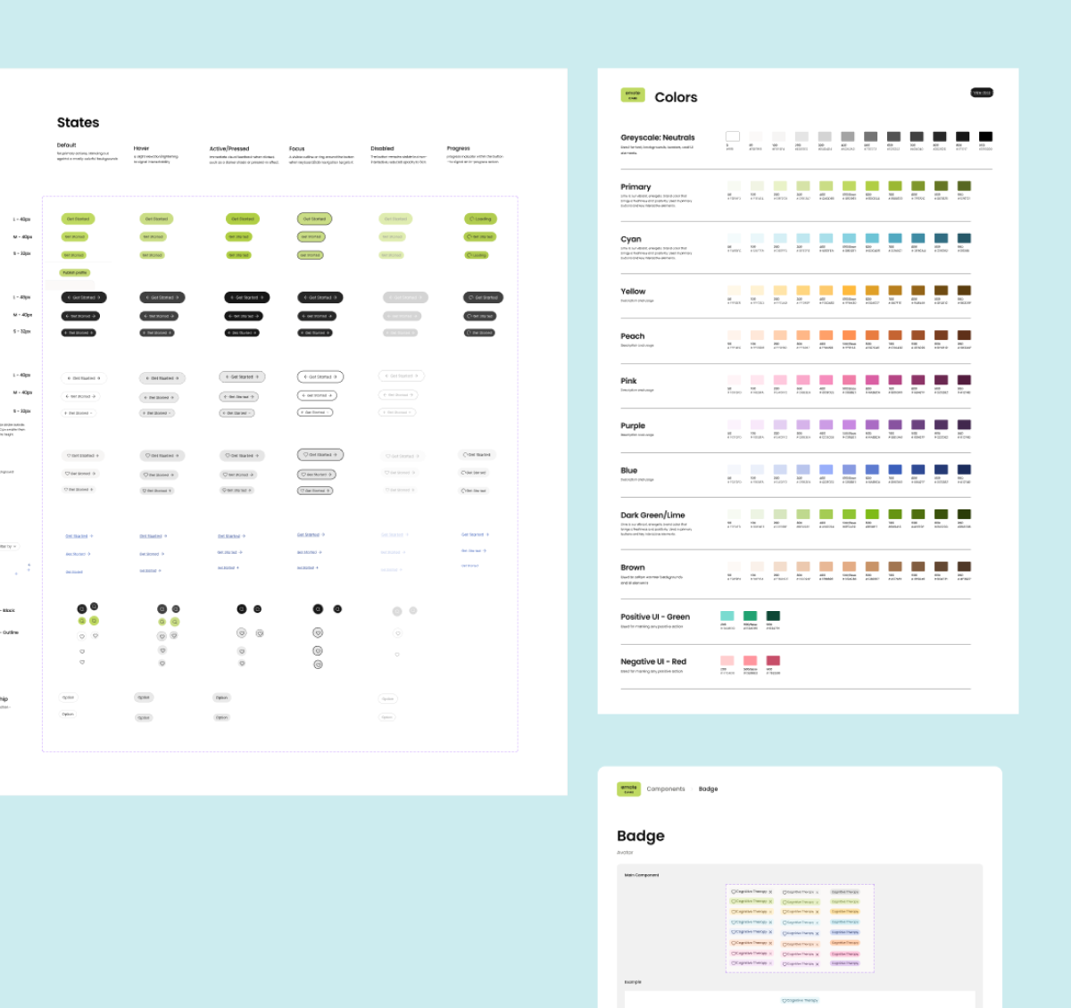
Delivery and collaboration
Designing for Scale & Shipping
I worked closely with a team of five front-end engineers to bring the product into production, ensuring a consistent and high-quality user experience.
I refined and extended the existing design system, adapting it for React and establishing reusable components and patterns to support scalability
and efficient development.
Key updates to Design system:
• Simplified and refined components to better support key user journeys
• Increased component flexibility for different use cases
• Established consistent patterns across the product and engineering
• Designed components with edge cases and different states in mind