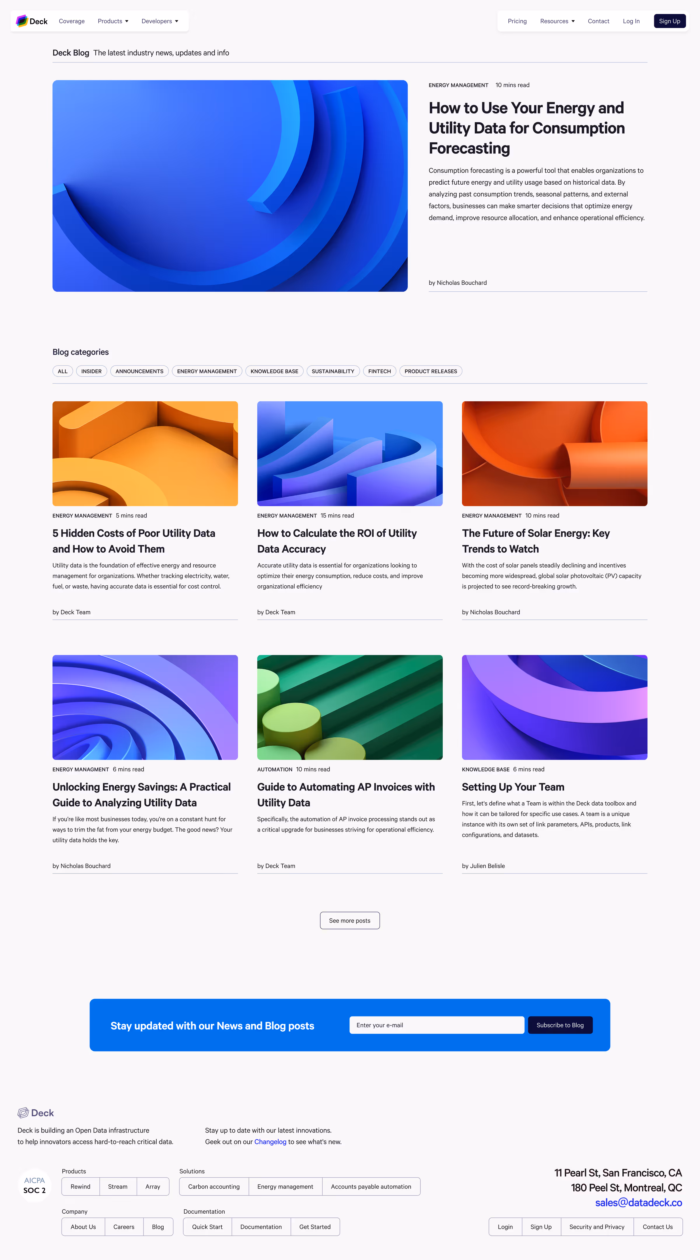
Case study • The Ultimate Money Bestie | Product Design
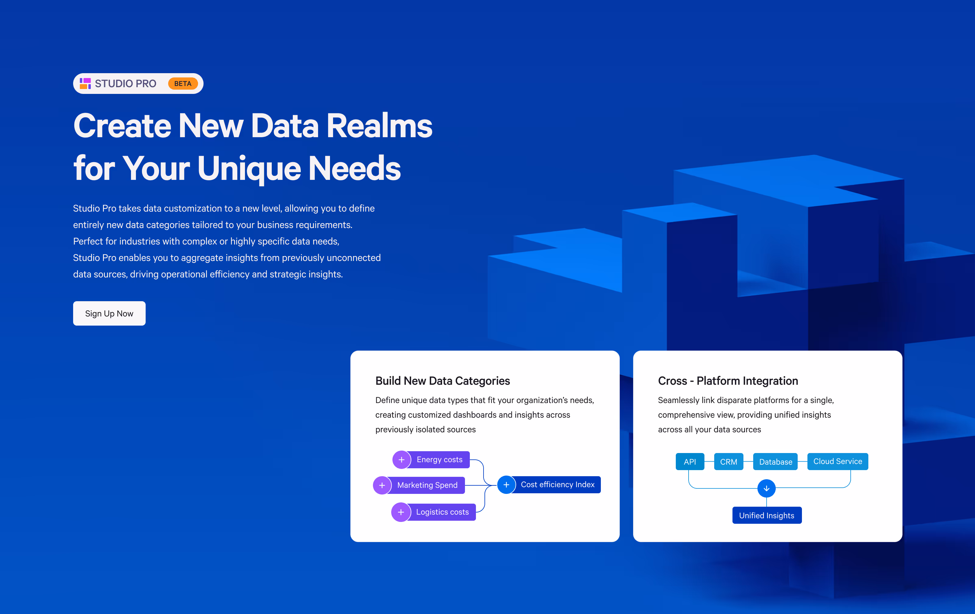
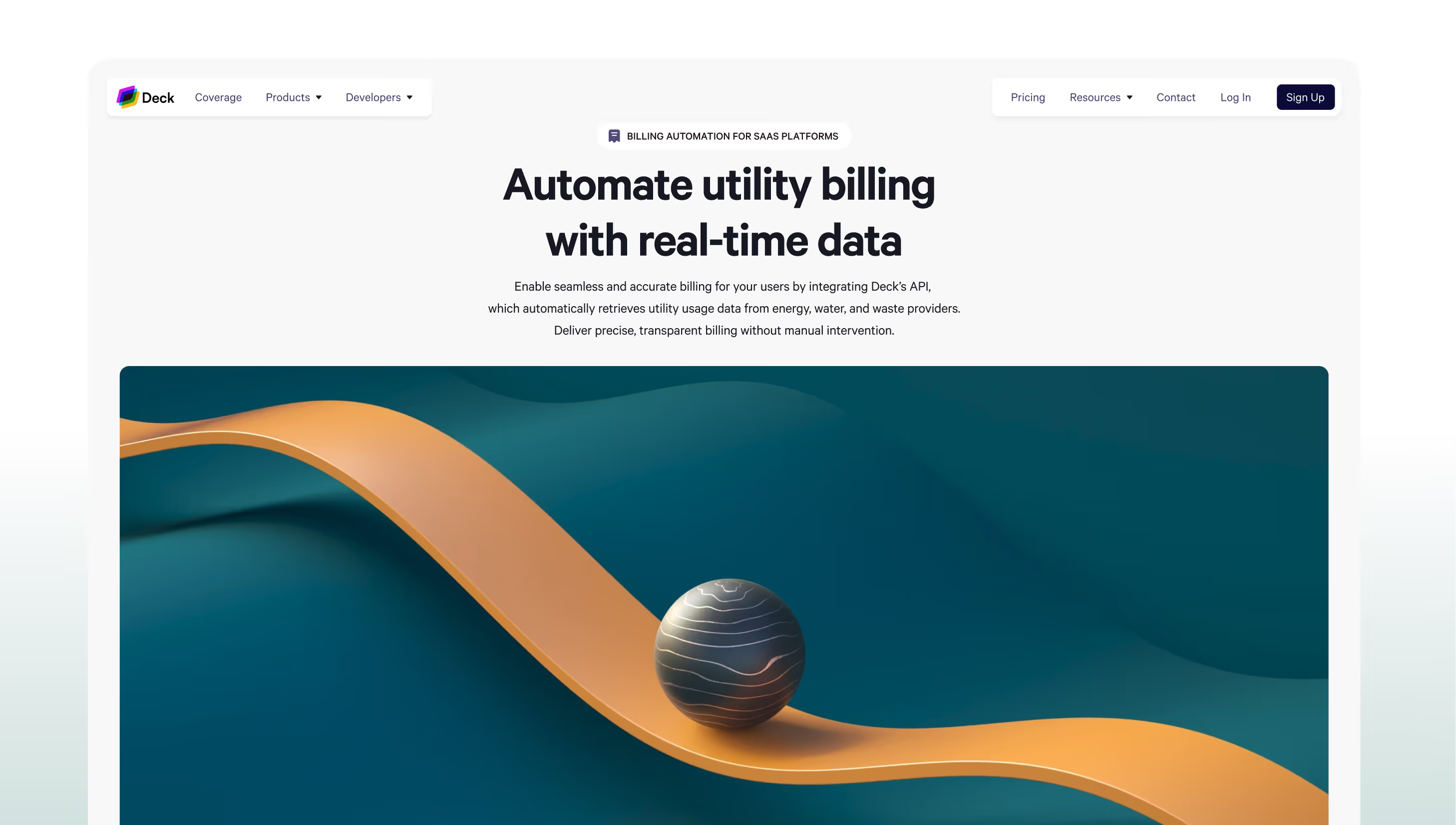
Turning Raw Data Into Clear Insights
I joined Deck.co as the founding designer, working closely with the founders and engineering team
to shape the product from the ground up. Deck enables platforms and businesses to automate provider connections
and access consumption data, translating complex infrastructure into a usable experience.
Leading end-to-end design across brand, web, and product, I transformed a highly technical proposition into a clear,
scalable system. This included defining the visual identity, building a design system, and designing core workflows
such as provider connections, data monitoring, and request flows.
The result: intuitive product experience, improved clarity around complex processes,
and a cohesive foundation that supports scale and future growth.
Role:
Founding Product Designer (0→1)
Platform:
Web
Scope:
End-to-end product design, UX strategy,
and visual Design system
(branding, UI, prototyping)
Duration:
8 months
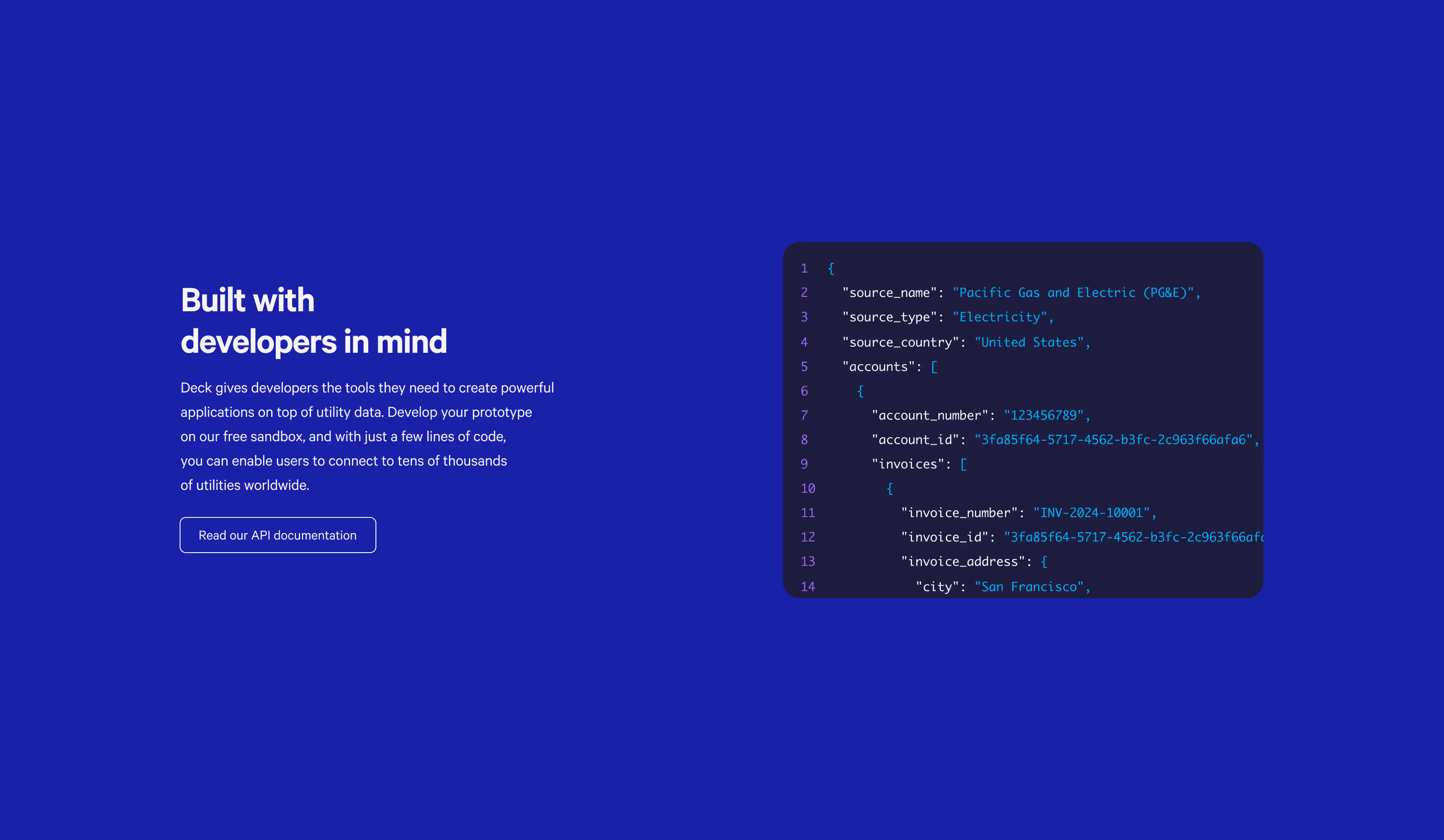
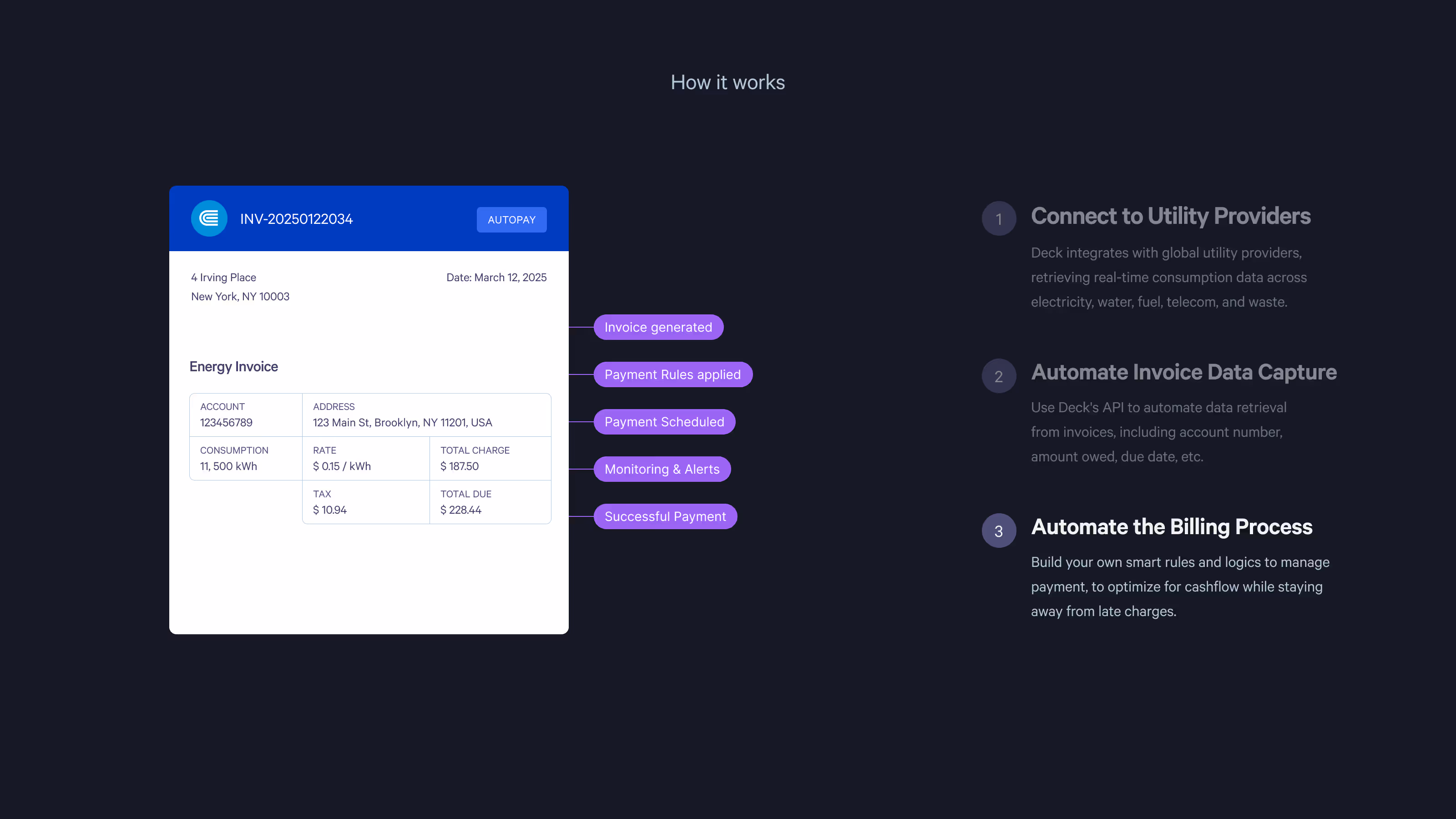
Deck helps platforms and businesses connect to utility providers via APIs and manage consumption data at scale. Clients use Deck to establish provider connections, monitor data, and resolve issues when connections fail or data is inconsistent.
The main Product challange:
The main challenge was translating a highly technical system—integrations, data states, and operational workflows—into an experience that feels clear and controllable for both internal teams and external clients.
Despite strong product capabilities, the experience presented several challenges:
• Complex workflows that were hard to follow
• Limited visibility into connection status and progress
• Overwhelming interfaces with unclear hierarchy
• Inconsistent patterns across different flows
This led to hesitation, errors, and increased reliance on manual support.
I focused on simplifying complex workflows through strong information architecture, consistent UI patterns, and a visual system that communicates data states clearly. The goal was to reduce cognitive load, increase visibility into connection health, and make problem resolution fast and predictable.
324
34%
22%
5.0
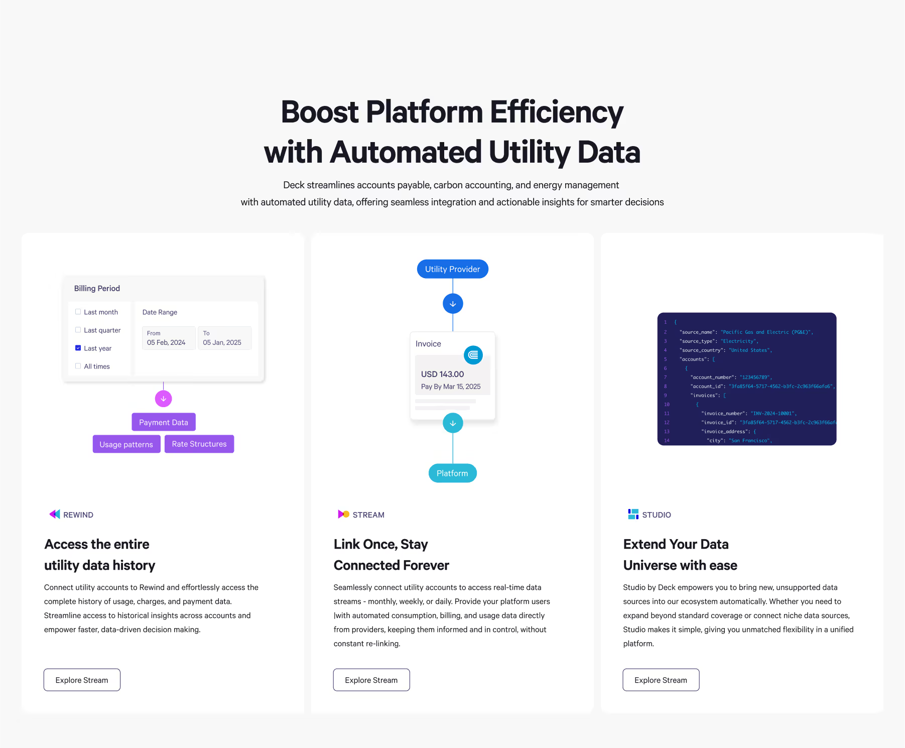
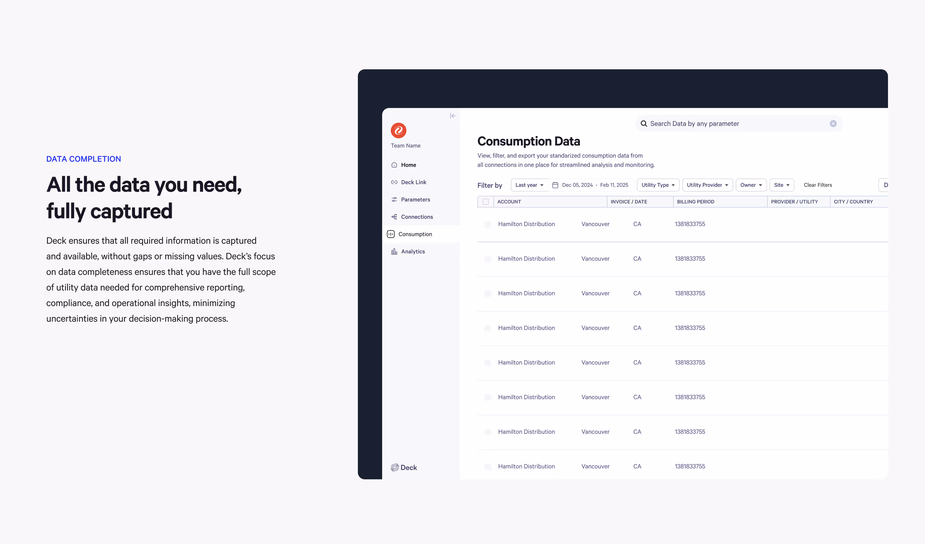
Core Product Experience
Data Monitoring & Issue Handling
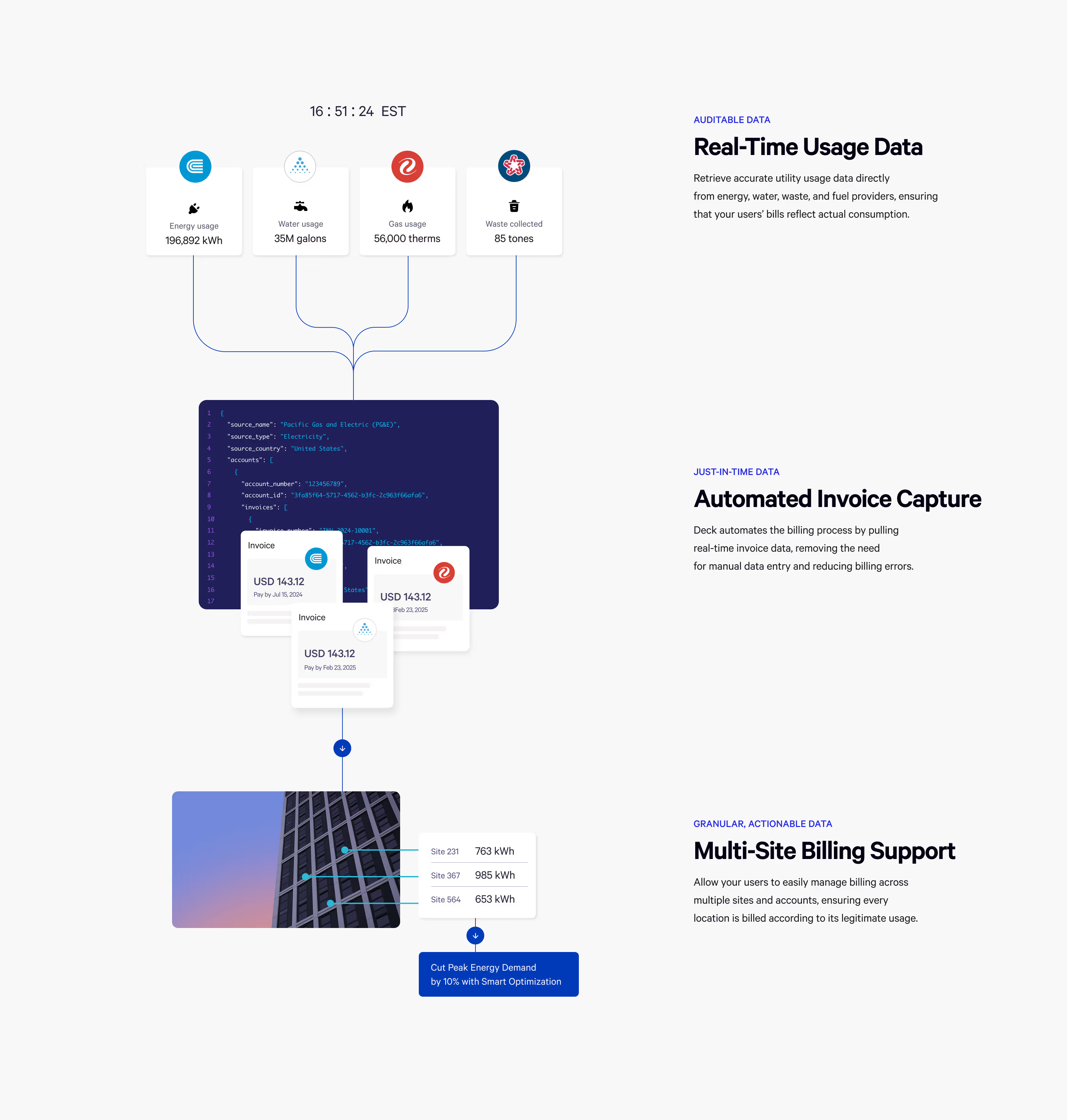
I designed the core dashboard to help users monitor provider connections and understand consumption data across accounts,
with clear visibility into status and performance.
What users can do
• Monitor connection health and status acrossproviders
• View consumption data at a high level, then drill down by account
• Identify where attention is needed quickly (issues, missing data, anomalies)


Flagging system
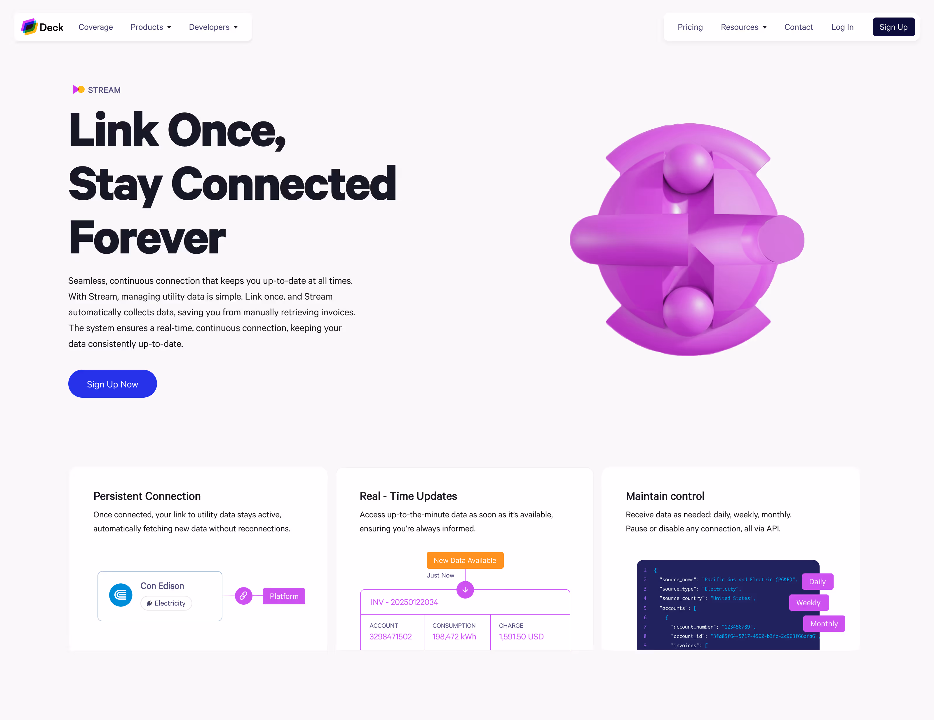
I designed an inline flagging system to help users quickly identify, understand, and report data issues without leaving the workflow. The goal was to reduce reliance on manual support and make issue reporting fast and contextual.
Clear Visual
Status Indicators
Flags were categorised and colour-coded
to communicate the severity and type of issue
at a glance.
Flags were categorised and colour-coded
to communicate the severity and type of issue
at a glance.

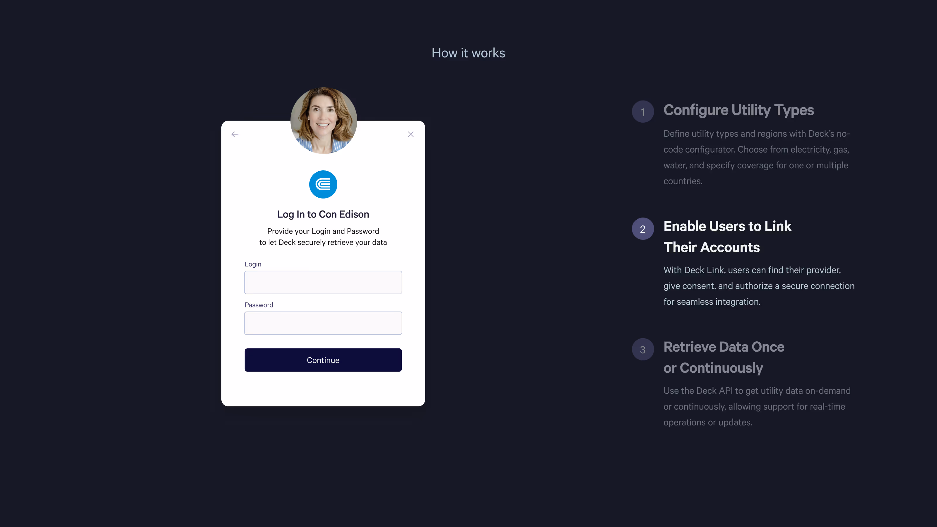
Reporting Issues
Without Leaving the Table
Flags were categorised and colour-coded
to communicate the severity and type of issue
at a glance.
1. Request Repair / Report IssueUsers initiate a report directly
from the flagged data point
2. Submit ReportA simple, structured input allows
users to provide context
3. ConfirmationUsers receive clear feedback that
the report has been sent
3. Status updateReports are tracked and updated,
keeping users informed


We identified our target user personas, which included young professionals, mothers balancing household finances, and women interested in long-term financial planning.
This laid the foundation for a user-centered design that would focus on education, training and empowerment.
By the end of the session, we had a clear vision that would guide us through the next steps.
Typography:
Calibre for Clarity and Elegance
I chose Calibre as the primary typeface due to its minimalistic, clean, and elegant design, perfectly aligning with the brand’s modern aesthetic. I developed a flexible type scale, ranging from super bold for impactful headlines to more delicate weights for smaller text, achieving both clarity and visual hierarchy. This type system was optimized for consistency across the website and product interfaces, serving as the foundation for the product’s type scale.


Lack of education
" I guess because I'm now much more aware of my financial situation, I feel like I'm losing an opportunity. It's just that I don't have the information and the security to do something different "

Lack of control
" It's not nice to make ends meet.
I don't understand why we make so much money, yet we still struggle with debt where we shouldn't be. Where is the money going? "
Misinformation
" I was getting fragmented information from different people, which made it hard to understand what to do. It felt like I was trying to piece together a puzzle."
Fear of risk
" I know that I'm not investing and I know that women in general are a bit risk averse and don't tend to invest as much, but it's something that I'd like to do, I know it's higher risk, but higher reward."
No habits
" Thinking about money around - feel guilt. I feel like I can’t spend any fun money because it should all go to kids. ADHD - impulsive with spending. Harder to save money. Shouldn't do that. Complex, specific things. Being mom has changed a lot. "
No confidence
" I haven’t done anything else. I didn’t feel confident doing it. Takes a lot of effort to look at things."
How women’s interactions with products and services can differ from men’s ?
Understanding the differences between men and women in communication, emotional engagement, and decision-making styles is crucial for designing products that effectively meet their needs and foster long-term attachment. It involves recognizing various behavioral, emotional, and social factors. Here are some key differences:
Communication style
Women:
Tend to favor more collaborative and conversational styles, often seeking detailed explanations and feedback. They might engage in discussions and value social support.
Men:
Often prefer direct, concise communication and may focus on problem-solving with less emphasis on collaborative dialogue.
Emotional Engagement
Women:
Generally more emotionally engaged with products and services, seeking features that resonate with their personal values and emotions. They may prioritize products that offer emotional support or connect with their identity.
Men:
May focus more on functionality and efficiency, sometimes placing less emphasis on emotional aspects.
Decision-Making Process
Women:
Often take a more holistic approach, considering how products fit into their overall lifestyle and long-term needs. They may value recommendations from peers or community feedback.
Men:
Might prioritize speed and efficiency in decision-making, focusing on immediate benefits and technical specifications.
Preference for Detail
Women:
Typically appreciate more detailed information and context about products, including user reviews and educational resources.
Men:
May prefer straightforward, high-level information and quick comparisons.
Design Aesthetics
Women:
May place a higher value on design aesthetics, including color schemes, styling, and visual appeal, in addition to functionality.
Men:
Often focus more on the practical aspects of design, such as durability and functionality.
Motivations and Goals
Women:
Might look for products that align with personal goals such as health, family, or lifestyle improvement, and prefer features that support these goals
Men:
Often focus more on the practical aspects of design, such as durability and functionality.
Feedback and Support
Women:
May seek more extensive customer support and follow-up, including personalized assistance and community support.
Men:
May prefer straightforward support solutions and less frequent interaction with customer service.
Mini-Infographics: Explaining Use Cases
Vector-Based Images acted as Standalone Stories and Mini-Infographics, Illustrating the Product's Use Cases. The Vibrant Color Palette made each Element Distinct, making Complex Concepts Understandable at a Glance. Some of these Visuals were Lottie-Animated or could be Seamlessly Converted into Dynamic Interactions.


Design System: UI Components Library
I created a UI Components Library using an 8px spacing system for consistent, precise design. The components are easy to customize and scale. This system sped up design, kept the brand consistent, and made updates simple.

Here's a snapshot of how it all came together.
This gallery captures the final outcome, just like in the live version: